package com.suno.android.common_ui.components
import androidx.compose.animation.core.CubicBezierEasing
import androidx.compose.animation.core.LinearEasing
import androidx.compose.animation.core.VectorConverter
import androidx.compose.animation.core.animateFloat
import androidx.compose.animation.core.animateValue
import androidx.compose.animation.core.infiniteRepeatable
import androidx.compose.animation.core.keyframes
import androidx.compose.animation.core.rememberInfiniteTransition
import androidx.compose.animation.core.tween
import androidx.compose.foundation.Canvas
import androidx.compose.foundation.layout.padding
import androidx.compose.foundation.layout.size
import androidx.compose.foundation.progressSemantics
import androidx.compose.material3.ExperimentalMaterial3Api
import androidx.compose.material3.ProgressIndicatorDefaults
import androidx.compose.runtime.Composable
import androidx.compose.ui.Modifier
import androidx.compose.ui.geometry.Offset
import androidx.compose.ui.geometry.Size
import androidx.compose.ui.graphics.Brush
import androidx.compose.ui.graphics.Color
import androidx.compose.ui.graphics.SolidColor
import androidx.compose.ui.graphics.StrokeCap
import androidx.compose.ui.graphics.drawscope.DrawScope
import androidx.compose.ui.graphics.drawscope.Stroke
import androidx.compose.ui.layout.layout
import androidx.compose.ui.platform.LocalDensity
import androidx.compose.ui.semantics.ProgressBarRangeInfo
import androidx.compose.ui.semantics.progressBarRangeInfo
import androidx.compose.ui.semantics.semantics
import androidx.compose.ui.unit.Dp
import androidx.compose.ui.unit.LayoutDirection
import androidx.compose.ui.unit.dp
import androidx.compose.ui.unit.offset
import kotlin.math.PI
import kotlin.math.abs
import kotlin.math.max
import kotlin.math.min
/**
* Determinate Material Design linear progress indicator.
*
* Progress indicators express an unspecified wait time or display the duration of a process.
*
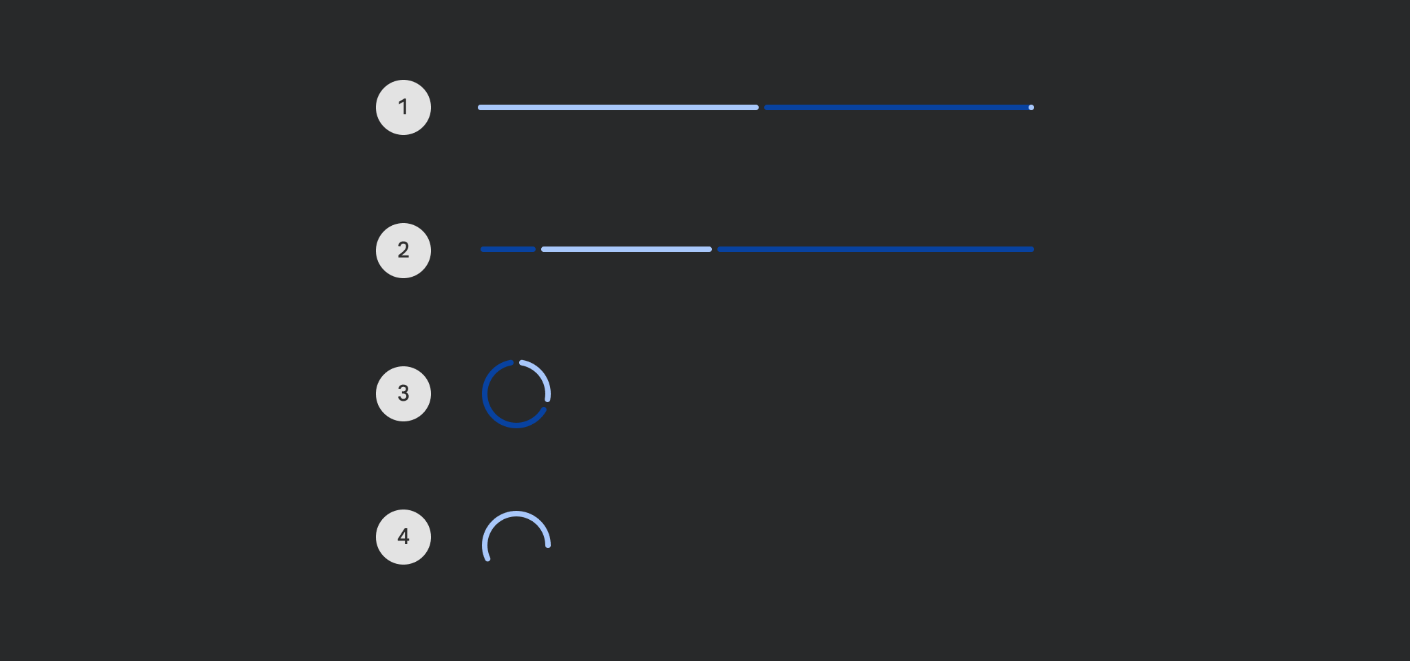
* 
*
* By default there is no animation between [progress] values. You can use
* [ProgressIndicatorDefaults.ProgressAnimationSpec] as the default recommended [AnimationSpec] when
* animating progress, such as in the following example:
*
* @sample androidx.compose.material3.samples.LinearProgressIndicatorSample
*
* @param progress the progress of this progress indicator, where 0.0 represents no progress and 1.0
* represents full progress. Values outside of this range are coerced into the range.
* @param modifier the [Modifier] to be applied to this progress indicator
* @param color color of this progress indicator
* @param trackColor color of the track behind the indicator, visible when the progress has not
* reached the area of the overall indicator yet
* @param strokeCap stroke cap to use for the ends of this progress indicator
* @param gapSize size of the gap between the progress indicator and the track
* @param drawStopIndicator lambda that will be called to draw the stop indicator
*/
@OptIn(ExperimentalMaterial3Api::class)
@Composable
fun LinearProgressIndicator(
progress: () -> Float,
modifier: Modifier = Modifier,
brush: Brush = SolidColor(ProgressIndicatorDefaults.linearColor),
trackBrush: Brush = SolidColor(ProgressIndicatorDefaults.linearTrackColor),
strokeCap: StrokeCap = ProgressIndicatorDefaults.LinearStrokeCap,
gapSize: Dp = ProgressIndicatorDefaults.LinearIndicatorTrackGapSize,
drawStopIndicator: DrawScope.() -> Unit = {
},
) {
val coercedProgress = { progress().coerceIn(0f, 1f) }
Canvas(
modifier
.then(IncreaseSemanticsBounds)
.semantics(mergeDescendants = true) {
progressBarRangeInfo = ProgressBarRangeInfo(coercedProgress(), 0f..1f)
}
.size(LinearIndicatorWidth, LinearIndicatorHeight),
) {
val strokeWidth = size.height
val adjustedGapSize = if (strokeCap == StrokeCap.Butt || size.height > size.width) {
gapSize
} else {
gapSize + strokeWidth.toDp()
}
val gapSizeFraction = adjustedGapSize / size.width.toDp()
val currentCoercedProgress = coercedProgress()
// track
val trackStartFraction = currentCoercedProgress + min(currentCoercedProgress, gapSizeFraction)
if (trackStartFraction <= 1f) {
drawLinearIndicator(trackStartFraction, 1f, trackBrush, strokeWidth, strokeCap)
}
// indicator
drawLinearIndicator(0f, currentCoercedProgress, brush, strokeWidth, strokeCap)
// stop
drawStopIndicator(this)
}
}
/**
* Indeterminate Material Design linear progress indicator.
*
* Progress indicators express an unspecified wait time or display the duration of a process.
*
* 
*
* @sample androidx.compose.material3.samples.IndeterminateLinearProgressIndicatorSample
*
* @param modifier the [Modifier] to be applied to this progress indicator
* @param brush color of this progress indicator
* @param trackColor color of the track behind the indicator, visible when the progress has not
* reached the area of the overall indicator yet
* @param strokeCap stroke cap to use for the ends of this progress indicator
* @param gapSize size of the gap between the progress indicator and the track
*/
@OptIn(ExperimentalMaterial3Api::class)
@Composable
fun LinearProgressIndicator(
modifier: Modifier = Modifier,
brush: Brush = SolidColor(ProgressIndicatorDefaults.linearColor),
trackColor: Brush = SolidColor(ProgressIndicatorDefaults.linearTrackColor),
strokeCap: StrokeCap = ProgressIndicatorDefaults.LinearStrokeCap,
gapSize: Dp = ProgressIndicatorDefaults.LinearIndicatorTrackGapSize,
) {
val infiniteTransition = rememberInfiniteTransition()
// Fractional position of the 'head' and 'tail' of the two lines drawn, i.e. if the head is 0.8
// and the tail is 0.2, there is a line drawn from between 20% along to 80% along the total
// width.
val firstLineHead = infiniteTransition.animateFloat(
0f,
1f,
infiniteRepeatable(
animation = keyframes {
durationMillis = LINEAR_ANIMATION_DURATION
0f at FIRST_LINE_HEAD_DELAY using FirstLineHeadEasing
1f at FIRST_LINE_HEAD_DURATION + FIRST_LINE_HEAD_DELAY
},
),
)
val firstLineTail = infiniteTransition.animateFloat(
0f,
1f,
infiniteRepeatable(
animation = keyframes {
durationMillis = LINEAR_ANIMATION_DURATION
0f at FIRST_LINE_TAIL_DELAY using FirstLineTailEasing
1f at FIRST_LINE_TAIL_DURATION + FIRST_LINE_TAIL_DELAY
},
),
)
val secondLineHead = infiniteTransition.animateFloat(
0f,
1f,
infiniteRepeatable(
animation = keyframes {
durationMillis = LINEAR_ANIMATION_DURATION
0f at SECOND_LINE_HEAD_DELAY using SecondLineHeadEasing
1f at SECOND_LINE_HEAD_DURATION + SECOND_LINE_HEAD_DELAY
},
),
)
val secondLineTail = infiniteTransition.animateFloat(
0f,
1f,
infiniteRepeatable(
animation = keyframes {
durationMillis = LINEAR_ANIMATION_DURATION
0f at SECOND_LINE_TAIL_DELAY using SecondLineTailEasing
1f at SECOND_LINE_TAIL_DURATION + SECOND_LINE_TAIL_DELAY
},
),
)
Canvas(
modifier
.then(IncreaseSemanticsBounds)
.progressSemantics()
.size(LinearIndicatorWidth, LinearIndicatorHeight),
) {
val strokeWidth = size.height
val adjustedGapSize = if (strokeCap == StrokeCap.Butt || size.height > size.width) {
gapSize
} else {
gapSize + strokeWidth.toDp()
}
val gapSizeFraction = adjustedGapSize / size.width.toDp()
// Track before line 1
if (firstLineHead.value < 1f - gapSizeFraction) {
val start = if (firstLineHead.value > 0) firstLineHead.value + gapSizeFraction else 0f
drawLinearIndicator(start, 1f, trackColor, strokeWidth, strokeCap)
}
// Line 1
if (firstLineHead.value - firstLineTail.value > 0) {
drawLinearIndicator(
firstLineHead.value,
firstLineTail.value,
brush,
strokeWidth,
strokeCap,
)
}
// Track between line 1 and line 2
if (firstLineTail.value > gapSizeFraction) {
val start = if (secondLineHead.value > 0) secondLineHead.value + gapSizeFraction else 0f
val end = if (firstLineTail.value < 1f) firstLineTail.value - gapSizeFraction else 1f
drawLinearIndicator(start, end, trackColor, strokeWidth, strokeCap)
}
// Line 2
if (secondLineHead.value - secondLineTail.value > 0) {
drawLinearIndicator(
secondLineHead.value,
secondLineTail.value,
brush,
strokeWidth,
strokeCap,
)
}
// Track after line 2
if (secondLineTail.value > gapSizeFraction) {
val end = if (secondLineTail.value < 1) secondLineTail.value - gapSizeFraction else 1f
drawLinearIndicator(0f, end, trackColor, strokeWidth, strokeCap)
}
}
}
private fun DrawScope.drawLinearIndicator(
startFraction: Float,
endFraction: Float,
color: Brush,
strokeWidth: Float,
strokeCap: StrokeCap,
) {
val width = size.width
val height = size.height
// Start drawing from the vertical center of the stroke
val yOffset = height / 2
val isLtr = layoutDirection == LayoutDirection.Ltr
val barStart = (if (isLtr) startFraction else 1f - endFraction) * width
val barEnd = (if (isLtr) endFraction else 1f - startFraction) * width
// if there isn't enough space to draw the stroke caps, fall back to StrokeCap.Butt
if (strokeCap == StrokeCap.Butt || height > width) {
// Progress line
drawLine(color, Offset(barStart, yOffset), Offset(barEnd, yOffset), strokeWidth)
} else {
// need to adjust barStart and barEnd for the stroke caps
val strokeCapOffset = strokeWidth / 2
val coerceRange = strokeCapOffset..(width - strokeCapOffset)
val adjustedBarStart = barStart.coerceIn(coerceRange)
val adjustedBarEnd = barEnd.coerceIn(coerceRange)
if (abs(endFraction - startFraction) > 0) {
// Progress line
drawLine(
color,
Offset(adjustedBarStart, yOffset),
Offset(adjustedBarEnd, yOffset),
strokeWidth,
strokeCap,
)
}
}
}
private val SemanticsBoundsPadding: Dp = 10.dp
private val IncreaseSemanticsBounds: Modifier = Modifier
.layout { measurable, constraints ->
val paddingPx = SemanticsBoundsPadding.roundToPx()
// We need to add vertical padding to the semantics bounds in order to meet
// screenreader green box minimum size, but we also want to
// preserve a visual appearance and layout size below that minimum
// in order to maintain backwards compatibility. This custom
// layout effectively implements "negative padding".
val newConstraint = constraints.offset(0, paddingPx * 2)
val placeable = measurable.measure(newConstraint)
// But when actually placing the placeable, create the layout without additional
// space. Place the placeable where it would've been without any extra padding.
val height = placeable.height - paddingPx * 2
val width = placeable.width
layout(width, height) { placeable.place(0, -paddingPx) }
}
.semantics(mergeDescendants = true) {}
.padding(vertical = SemanticsBoundsPadding)
/**
* Determinate Material Design circular progress indicator.
*
* Progress indicators express an unspecified wait time or display the duration of a process.
*
* 
*
* By default there is no animation between [progress] values. You can use
* [ProgressIndicatorDefaults.ProgressAnimationSpec] as the default recommended [AnimationSpec] when
* animating progress, such as in the following example:
*
* @sample androidx.compose.material3.samples.CircularProgressIndicatorSample
*
* @param progress the progress of this progress indicator, where 0.0 represents no progress and 1.0
* represents full progress. Values outside of this range are coerced into the range.
* @param modifier the [Modifier] to be applied to this progress indicator
* @param color color of this progress indicator
* @param strokeWidth stroke width of this progress indicator
* @param trackColor color of the track behind the indicator, visible when the progress has not
* reached the area of the overall indicator yet
* @param strokeCap stroke cap to use for the ends of this progress indicator
* @param gapSize size of the gap between the progress indicator and the track
*/
@OptIn(ExperimentalMaterial3Api::class)
@Composable
fun CircularProgressIndicator(
progress: () -> Float,
modifier: Modifier = Modifier,
color: Color = ProgressIndicatorDefaults.circularColor,
strokeWidth: Dp = ProgressIndicatorDefaults.CircularStrokeWidth,
trackColor: Color = ProgressIndicatorDefaults.circularDeterminateTrackColor,
strokeCap: StrokeCap = ProgressIndicatorDefaults.CircularDeterminateStrokeCap,
gapSize: Dp = ProgressIndicatorDefaults.CircularIndicatorTrackGapSize,
) {
val coercedProgress = { progress().coerceIn(0f, 1f) }
val stroke = with(LocalDensity.current) { Stroke(width = strokeWidth.toPx(), cap = strokeCap) }
Canvas(
modifier
.semantics(mergeDescendants = true) {
progressBarRangeInfo = ProgressBarRangeInfo(coercedProgress(), 0f..1f)
}
.size(CircularIndicatorDiameter),
) {
// Start at 12 o'clock
val startAngle = 270f
val sweep = coercedProgress() * 360f
val adjustedGapSize = if (strokeCap == StrokeCap.Butt || size.height > size.width) {
gapSize
} else {
gapSize + strokeWidth
}
val gapSizeSweep = (adjustedGapSize.value / (Math.PI * size.width.toDp().value).toFloat()) * 360f
drawCircularIndicator(
startAngle + sweep + min(sweep, gapSizeSweep),
360f - sweep - min(sweep, gapSizeSweep) * 2,
trackColor,
stroke,
)
drawDeterminateCircularIndicator(startAngle, sweep, color, stroke)
}
}
/**
* Indeterminate Material Design circular progress indicator.
*
* Progress indicators express an unspecified wait time or display the duration of a process.
*
* 
*
* @sample androidx.compose.material3.samples.IndeterminateCircularProgressIndicatorSample
*
* @param modifier the [Modifier] to be applied to this progress indicator
* @param color color of this progress indicator
* @param strokeWidth stroke width of this progress indicator
* @param trackColor color of the track behind the indicator, visible when the progress has not
* reached the area of the overall indicator yet
* @param strokeCap stroke cap to use for the ends of this progress indicator
*/
@Composable
fun CircularProgressIndicator(
modifier: Modifier = Modifier,
color: Color = ProgressIndicatorDefaults.circularColor,
strokeWidth: Dp = ProgressIndicatorDefaults.CircularStrokeWidth,
trackColor: Color = ProgressIndicatorDefaults.circularIndeterminateTrackColor,
strokeCap: StrokeCap = ProgressIndicatorDefaults.CircularIndeterminateStrokeCap,
) {
val stroke = with(LocalDensity.current) { Stroke(width = strokeWidth.toPx(), cap = strokeCap) }
val transition = rememberInfiniteTransition()
// The current rotation around the circle, so we know where to start the rotation from
val currentRotation = transition.animateValue(
0,
ROTATIONS_PER_CYCLE,
Int.VectorConverter,
infiniteRepeatable(
animation = tween(
durationMillis = ROTATION_DURATION * ROTATIONS_PER_CYCLE,
easing = LinearEasing,
),
),
)
// How far forward (degrees) the base point should be from the start point
val baseRotation = transition.animateFloat(
0f,
BASE_ROTATION_ANGLE,
infiniteRepeatable(
animation = tween(durationMillis = ROTATION_DURATION, easing = LinearEasing),
),
)
// How far forward (degrees) both the head and tail should be from the base point
val endAngle = transition.animateFloat(
0f,
JUMP_ROTATION_ANGLE,
infiniteRepeatable(
animation = keyframes {
durationMillis = HEAD_AND_TAIL_ANIMATION_DURATION + HEAD_AND_TAIL_DELAY_DURATION
0f at 0 using CircularEasing
JUMP_ROTATION_ANGLE at HEAD_AND_TAIL_ANIMATION_DURATION
},
),
)
val startAngle = transition.animateFloat(
0f,
JUMP_ROTATION_ANGLE,
infiniteRepeatable(
animation = keyframes {
durationMillis = HEAD_AND_TAIL_ANIMATION_DURATION + HEAD_AND_TAIL_DELAY_DURATION
0f at HEAD_AND_TAIL_DELAY_DURATION using CircularEasing
JUMP_ROTATION_ANGLE at durationMillis
},
),
)
Canvas(
modifier
.progressSemantics()
.size(CircularIndicatorDiameter),
) {
drawCircularIndicatorTrack(trackColor, stroke)
val currentRotationAngleOffset = (currentRotation.value * ROTATION_ANGLE_OFFSET) % 360f
// How long a line to draw using the start angle as a reference point
val sweep = abs(endAngle.value - startAngle.value)
// Offset by the constant offset and the per rotation offset
val offset = START_ANGLE_OFFSET + currentRotationAngleOffset + baseRotation.value
drawIndeterminateCircularIndicator(
startAngle.value + offset,
strokeWidth,
sweep,
color,
stroke,
)
}
}
private fun DrawScope.drawCircularIndicator(
startAngle: Float,
sweep: Float,
color: Color,
stroke: Stroke,
) {
// To draw this circle we need a rect with edges that line up with the midpoint of the stroke.
// To do this we need to remove half the stroke width from the total diameter for both sides.
val diameterOffset = stroke.width / 2
val arcDimen = size.width - 2 * diameterOffset
drawArc(
color = color,
startAngle = startAngle,
sweepAngle = sweep,
useCenter = false,
topLeft = Offset(diameterOffset, diameterOffset),
size = Size(arcDimen, arcDimen),
style = stroke,
)
}
private fun DrawScope.drawCircularIndicatorTrack(
color: Color,
stroke: Stroke,
) = drawCircularIndicator(0f, 360f, color, stroke)
private fun DrawScope.drawDeterminateCircularIndicator(
startAngle: Float,
sweep: Float,
color: Color,
stroke: Stroke,
) = drawCircularIndicator(startAngle, sweep, color, stroke)
private fun DrawScope.drawIndeterminateCircularIndicator(
startAngle: Float,
strokeWidth: Dp,
sweep: Float,
color: Color,
stroke: Stroke,
) {
val strokeCapOffset = if (stroke.cap == StrokeCap.Butt) {
0f
} else {
// Length of arc is angle * radius
// Angle (radians) is length / radius
// The length should be the same as the stroke width for calculating the min angle
(180.0 / PI).toFloat() * (strokeWidth / (CircularIndicatorDiameter / 2)) / 2f
}
// Adding a stroke cap draws half the stroke width behind the start point, so we want to
// move it forward by that amount so the arc visually appears in the correct place
val adjustedStartAngle = startAngle + strokeCapOffset
// When the start and end angles are in the same place, we still want to draw a small sweep, so
// the stroke caps get added on both ends and we draw the correct minimum length arc
val adjustedSweep = max(sweep, 0.1f)
drawCircularIndicator(adjustedStartAngle, adjustedSweep, color, stroke)
}
// Width is given in the spec but not defined as a token.
/*@VisibleForTesting*/
internal val LinearIndicatorWidth = 240.dp
/*@VisibleForTesting*/
internal val LinearIndicatorHeight = 4.0.dp
// CircularProgressIndicator Material specs
// Diameter of the indicator circle
/*@VisibleForTesting*/
internal val CircularIndicatorDiameter = 48.dp - LinearIndicatorHeight * 2
// Indeterminate linear indicator transition specs
// Total duration for one cycle
private const val LINEAR_ANIMATION_DURATION = 1800
// Duration of the head and tail animations for both lines
private const val FIRST_LINE_HEAD_DURATION = 750
private const val FIRST_LINE_TAIL_DURATION = 850
private const val SECOND_LINE_HEAD_DURATION = 567
private const val SECOND_LINE_TAIL_DURATION = 533
// Delay before the start of the head and tail animations for both lines
private const val FIRST_LINE_HEAD_DELAY = 0
private const val FIRST_LINE_TAIL_DELAY = 333
private const val SECOND_LINE_HEAD_DELAY = 1000
private const val SECOND_LINE_TAIL_DELAY = 1267
private val FirstLineHeadEasing = CubicBezierEasing(0.2f, 0f, 0.8f, 1f)
private val FirstLineTailEasing = CubicBezierEasing(0.4f, 0f, 1f, 1f)
private val SecondLineHeadEasing = CubicBezierEasing(0f, 0f, 0.65f, 1f)
private val SecondLineTailEasing = CubicBezierEasing(0.1f, 0f, 0.45f, 1f)
// Indeterminate circular indicator transition specs
// The animation comprises of 5 rotations around the circle forming a 5 pointed star.
// After the 5th rotation, we are back at the beginning of the circle.
private const val ROTATIONS_PER_CYCLE = 5
// Each rotation is 1 and 1/3 seconds, but 1332ms divides more evenly
private const val ROTATION_DURATION = 1332
// When the rotation is at its beginning (0 or 360 degrees) we want it to be drawn at 12 o clock,
// which means 270 degrees when drawing.
private const val START_ANGLE_OFFSET = -90f
// How far the base point moves around the circle
private const val BASE_ROTATION_ANGLE = 286f
// How far the head and tail should jump forward during one rotation past the base point
private const val JUMP_ROTATION_ANGLE = 290f
// Each rotation we want to offset the start position by this much, so we continue where
// the previous rotation ended. This is the maximum angle covered during one rotation.
private const val ROTATION_ANGLE_OFFSET = (BASE_ROTATION_ANGLE + JUMP_ROTATION_ANGLE) % 360f
// The head animates for the first half of a rotation, then is static for the second half
// The tail is static for the first half and then animates for the second half
private const val HEAD_AND_TAIL_ANIMATION_DURATION = (ROTATION_DURATION * 0.5).toInt()
private const val HEAD_AND_TAIL_DELAY_DURATION = HEAD_AND_TAIL_ANIMATION_DURATION
// The easing for the head and tail jump
private val CircularEasing = CubicBezierEasing(0.4f, 0f, 0.2f, 1f)